What I like about the Tuesday morning
Intro to Tate Course (CityLit) is how absolutely packed it is with 'stuff' - and at the end of it you've got things to think about and follow up - 17 of us this week and I think too many more would be a challenge in such a busy exhibition space.
 |
| Untitled by Rudolf Stingle (1993) |
We started at the same point as we had the previous week on the fourth floor but what I and (and I think others) had not observed is that this itself was a 'work'.
In fact this work has already challenged my distaste for the 'Untitled' label - what would/could you call it? It's this or the minimal Orange Carpet I suppose.
The work allows the viewer to engage and make a mark - reminding me of those early cave paintings but I suppose it's a touch of subversion too in what many of use take as a sombre viewing experience.
Seems the artist
Rudolf Stingle has a bit of history of these works - CarpetRight anyone?
We took a look at Mondrian's works too and it generally on closer observation felt more complex than a quick look would suggest -I remain amused about his falling out with a colleague who started doing some non linear work (although he started in a representational style) .
 |
| Sparse even by Mondrian's standard |
 |
| And with added Blue and Yellow |
 |
| And nearby building reminded me of the 'De Stijle' style too |
 |
| A variety of prints of an Electric Chair |
 |
| Another famous work by Andy |
Andy gave good quote too and Ed used (and uses) text .
 |
| An example of the man's words |
 |
| Ed Ruscha uses words in his works |
As well as Pop we had a look at some interventionist works as well as (perhaps) conceptual (isn't it all?).
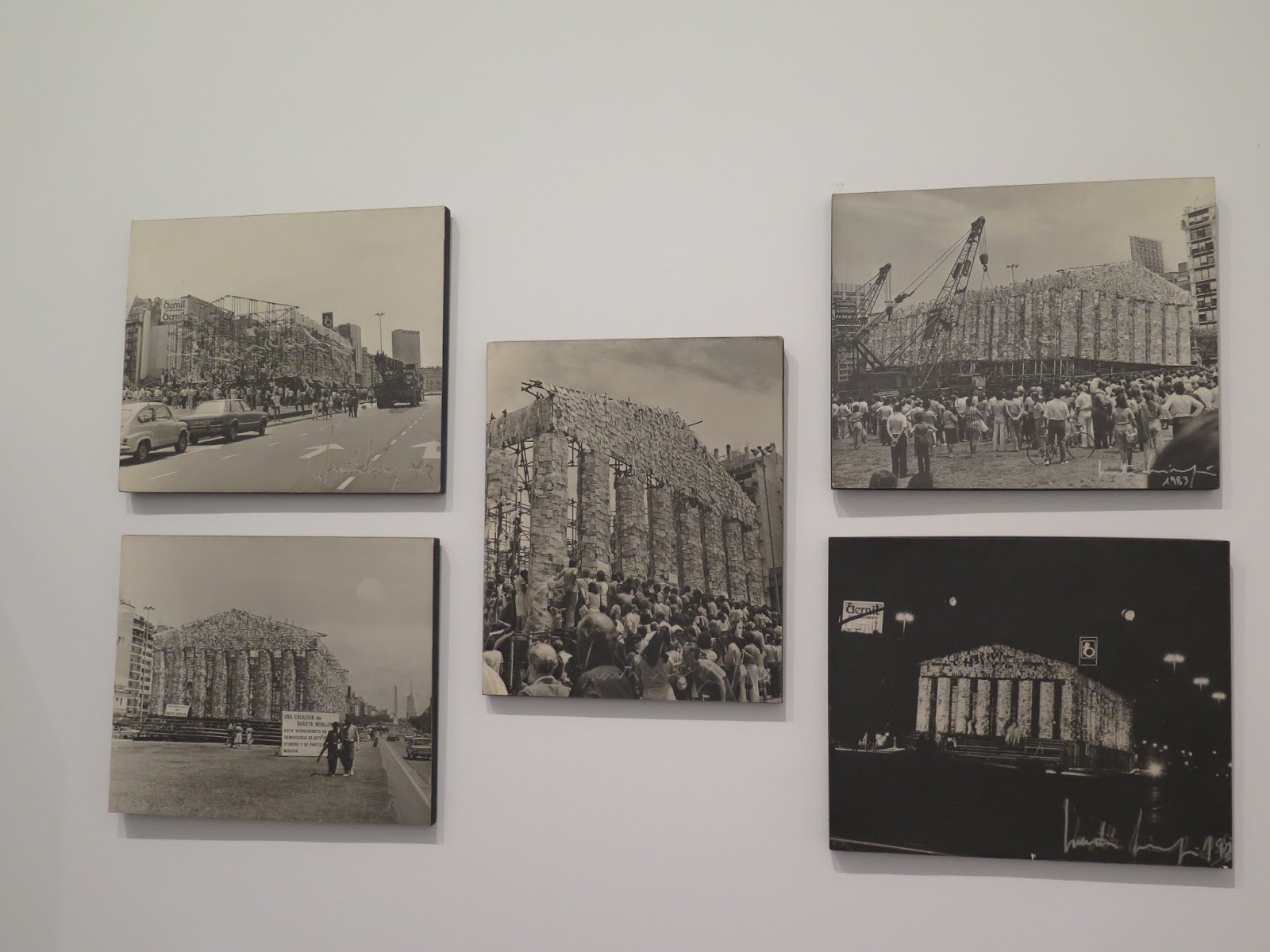
 |
| Parthenon of books by Marta Minujin - it's about Argentina and made from books that were banned during the junta time there |
And nearby two works about Coca-Cola their appropriation of a font (Antony Caro) and printing slogans on mass produced cultural symbols (Cido Miereles) .
 |
| A bit out of character for Caro? |
 |
| Look at the words added |
How are photographs of intervention viewed as Art - does a photograph stand in effectively?
These two I find aesthetically pleasing and interesting as (perhaps) a reference to some of the Walking Art of this period.
After this we spent some time in the Switch looking at work which I again would characterise as being about materials (more about this later).
 |
| Clocking in at £52 21 |
At this weeks visit we also asked ourselves about the White Cube gallery concept - walls that do not intrude or comment on the work - seems a white floor too would be excessive and they're generally neutral and in case of Tate Modern Wood.
Front Doors (all roads lead home)
As they say and here it does..
 |
| Said to have been used by Steptoe & Son |

 |
| The Old Front Door looks the same |


No comments:
Post a Comment