 |
| Leading us on to 'The Collection' |
Ilona's piece is all about the law and the idea of the theatre of a case around a fraudulent win of the (UK) National Lottery - the exhibition shows sets that one can imaging in a drama retelling the story and locates it alongside other memorable fictional court drama's that we're familiar with an intriguing idea that seems close to reality.
 |
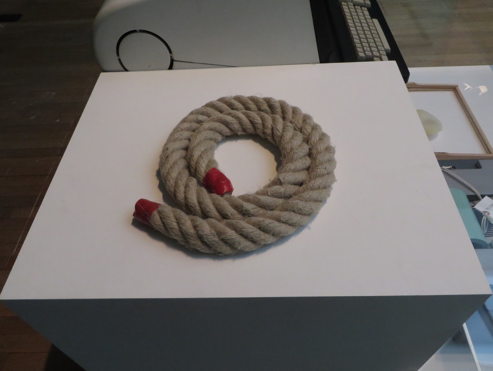
| A rope selected by Ilona |
Nearby too are 'design' items selected the designers who have contributed to the disruptive theme, for Ilona this a rope knot.
Stop 4- GOV.UK
What is particularly noteworthy about the 2013 design winners GOV.UK is that it very much a team effort and the team is from somewhat surprisingly (to me) the state sector.
It is also different in that it is not so much a physical design as a 'user experience' and has the ability (and requirement) to be changed and to adapt.
On making the award mention was made of the use of an adapted Margaret Calvert typeface, the original typeface having been used in the classic motorway sign-age, this though is ofd course only a part of the design.
 |
| The words that go with the design 'item' |
No comments:
Post a Comment